TPS Colour Comp
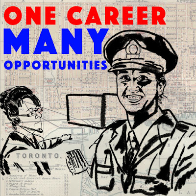
For my Toronto police service colour comp, I wanted to emphasize the diversity, by illustrating women in two different areas of police work. I did simple illustrations for each, to make it more of a general female for each. I wanted to make sure the police officer was depicted with a friendly smile. Since we were urged to use textures, images or objects in our design as opposed to just digital brushes, I added in an old map of Toronto as the background, with a lowered opacity, to tie everything in together.


Comments
Post a Comment