Posts

COVID-19 PSA

Image
COVID-19 PSA For this assignment we had to create a PSA, using information gathered from the Government of Canada's website, for the COVID-19 outbreak. I chose to create my safety poster in a square shaped instagram format. I did a safety poster advising people to wash their hands, I thought the graphic illustration really spoke for itself so I only added small type in the bottom corner. Though these are not fun circumstances, I wanted to add 'fun' colours and illustration styles to this graphic to spread an important message with a positive, not fearful or sterile, type of feel. Which was also the reasoning behind having the the virus depictions have a cartoonish feel.

6 frame storyboarding

Image
For this assignment, which required a 6 frame thumbnail storyboard of an existing scene or a made up scene. I used The Natural as my inspiration and reference for this. Using the scene in which Roy Hobbs strikes out the Whammer, who was regarded as the greatest player, which in turn gets Hobbs shot by the crazed fan depicted in the sixth frame, as a result of her seeing that Hobbs is the best player in the game.  For the storyboard I used a variety of close up and far wide shots for my thumbnails. I picked out six frames which I felt best illustrated the scene as a whole. And first digitally painted them in greyscale to get all my values and everything set. Greyscale Storyboard I then coloured in all the frames in full colour to give the full idea and light angles that are present in every scene. Colour StoryBoard

TPS Colour Comp

Image
For my Toronto police service colour comp, I wanted to emphasize the diversity, by illustrating women in two different areas of police work. I did simple illustrations for each, to make it more of a general female for each. I wanted to make sure the police officer was depicted with a friendly smile. Since we were urged to use textures, images or objects in our design as opposed to just digital brushes, I added in an old map of Toronto as the background, with a lowered opacity, to tie everything in together. 

TPS Thumbnails

Image
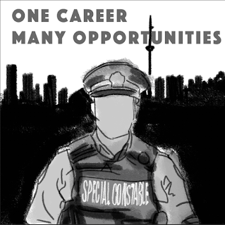
Some thumbnails for a Toronto Police instagram post for recruiting.

Grim Reaper Colour

Image
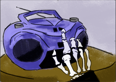
For the final step in the Grim Reaper storyboarding, colour was added. I used the same technique for each of the four storyboard. Using a textured brush and selecting a colour. I started colour with the object furthest in the back and worked my way to the closest object. After a base layer of each colour was added. Using the magic wand to select individual objects/colours, I added shadows and highlights using a slightly darker and lighter tone of each colour based on where the light was coming in. Part 1- Grim turns on speaker. Part 2- Grim lights candle. Part 3- Grim adds bubble bath. Part 4- Grim sitting in bathtub, which is a little small for him.

Grim Reaper Storyboard: Thumbnails & Line Art

Image
Starting off with some thumbnails showing the storyboard sequence. 1. Pressing play on speaker 2. Lighting a candle 3. Putting bubble bath in bathtub 4. Grim sitting in bathtub Then onto some more put together lineart. Starting off with scene 1, of course. Onto scene 2... Scene 3. Scene 4.